Case study · 02
Ascend
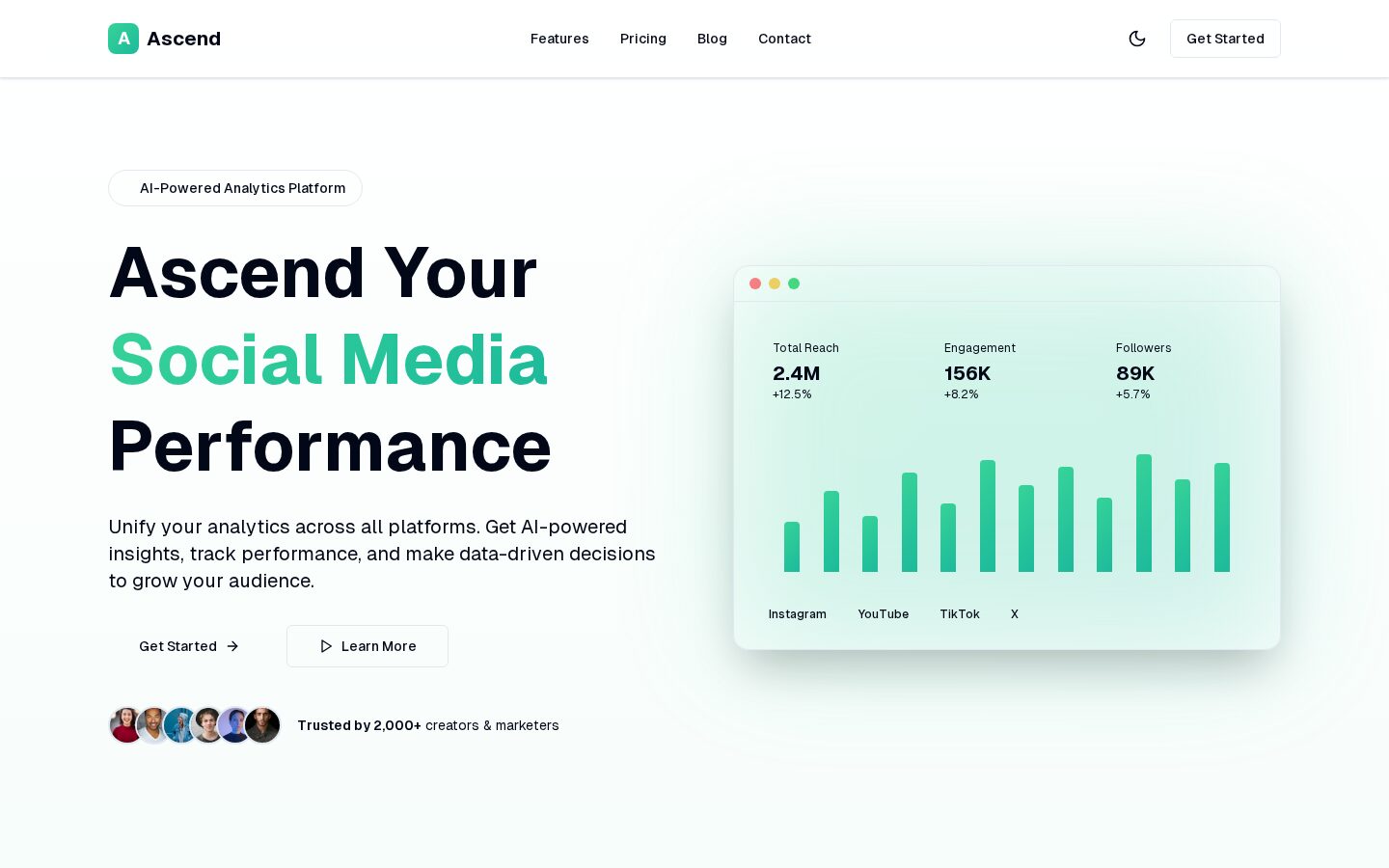
Ascend brings a creator's performance across platforms into one place, so the numbers turn into decisions instead of dashboards.
- Role
- Product Engineer
- Scope
- Product design · Frontend · Data modelling · Integration
- Platform
- Web
- Year
- 2026
Overview
Analytics and insights designed to help content creators understand what is working.
The Challenge
The Challenge
Creators publish across several platforms and each one reports on its own terms. The raw numbers exist, but they are fragmented, inconsistently defined and rarely answer the only question that matters: what is actually working, and what should I do more of.
Approach
Approach
I modelled the product around comparison rather than collection. Metrics are grouped so reach, engagement and audience growth can be read against each other and across time, and the default view answers a question instead of presenting every available chart at once.
Design
Design
Data-dense screens fail when everything competes for attention, so the interface uses a quiet surface, restrained accent colour for the values that matter and consistent chart treatments. Numbers are typeset for scanning, with change indicators carrying the signal.
Engineering
Engineering
A typed frontend consumes normalised metric shapes from an API layer, which keeps platform-specific quirks out of the interface. Aggregation and time-window logic live behind that boundary so new sources can be added without redesigning the dashboard.
Outcome
Outcome
Ascend is live in beta with the multi-platform analytics dashboard, time-range comparison and performance breakdowns implemented.